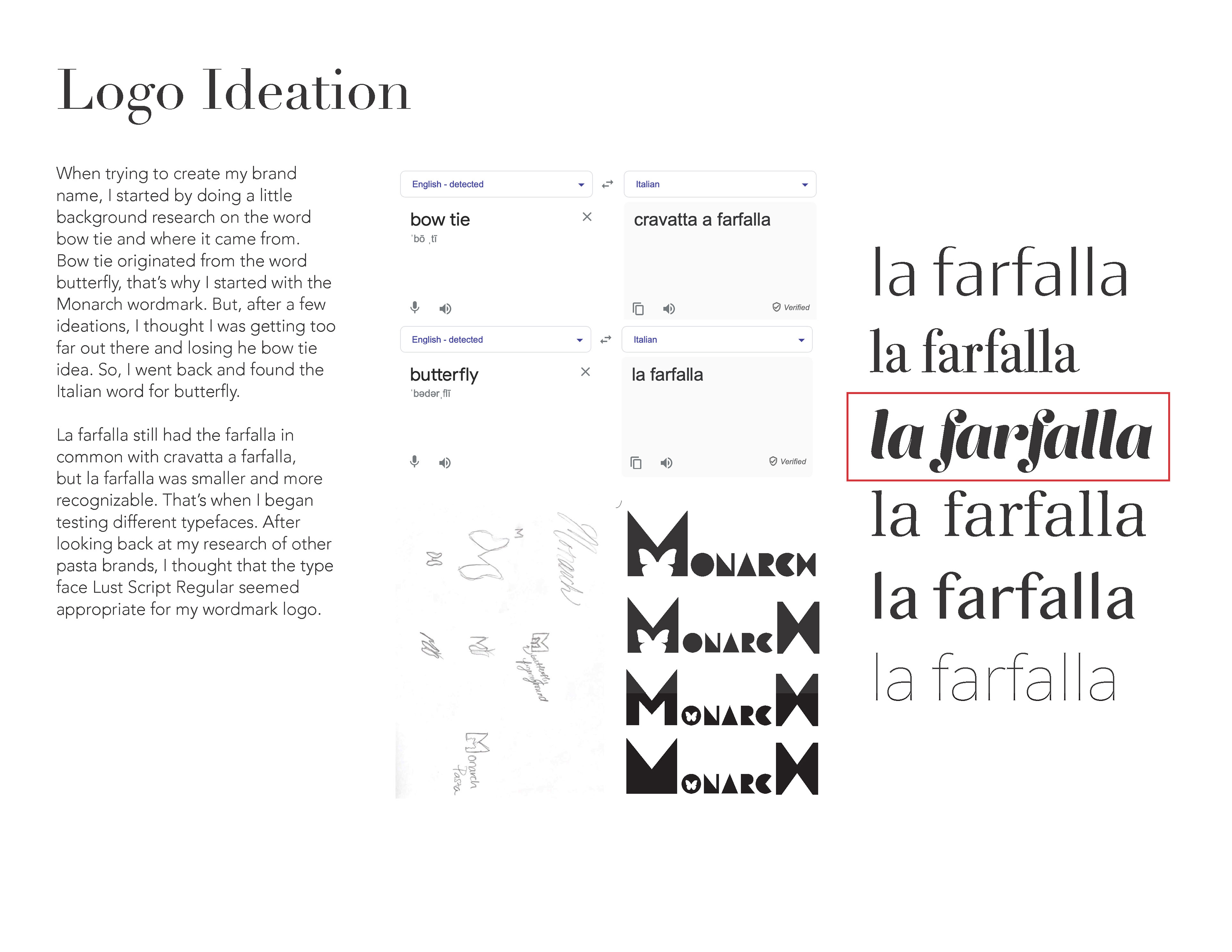
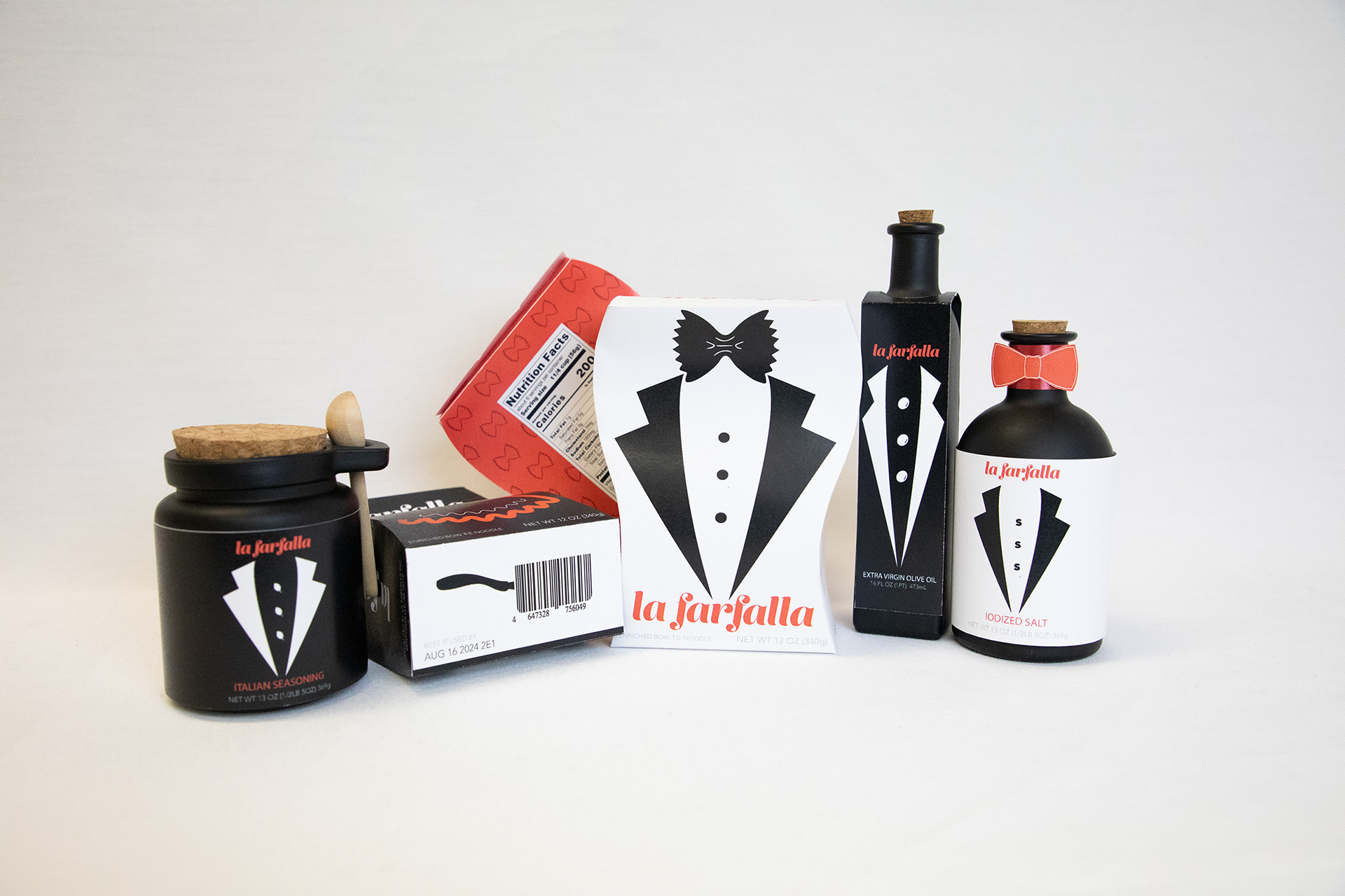
La Farfalla is a fictitious Italian pasta and spices company that has been in the same family for generations. The name La Farfalla originated from the butterfly shape of the bow-tie pasta. The brand aesthetic was established after creating three visual methodologies to design the pasta boxes. Once the client chose the aesthetic that communicated what the company wanted to convey, the line of spices and oils was designed.
Innovation Center of Design Excellence 2023 Packaging Design: Silver Medal
https://icde.co/pages/package-design-winners
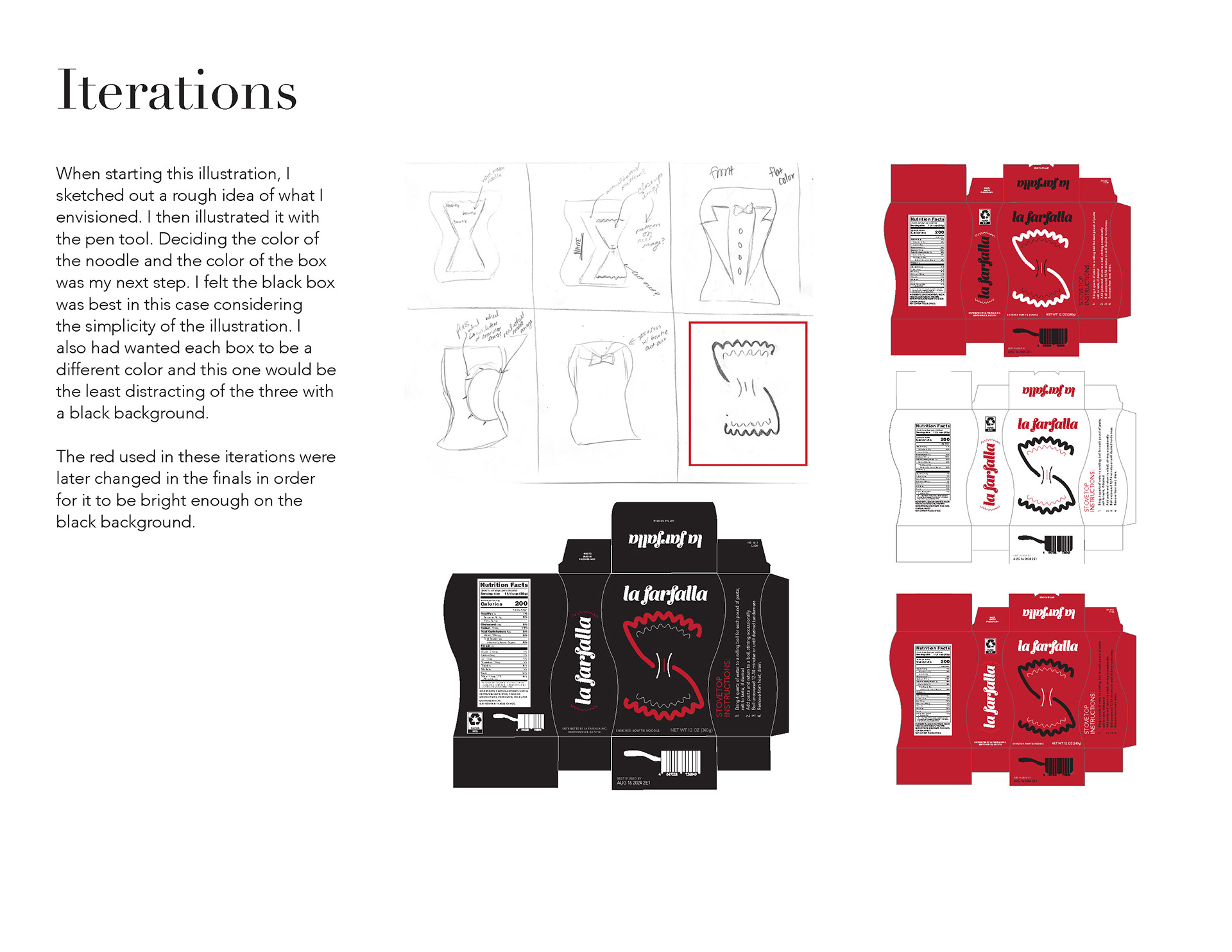
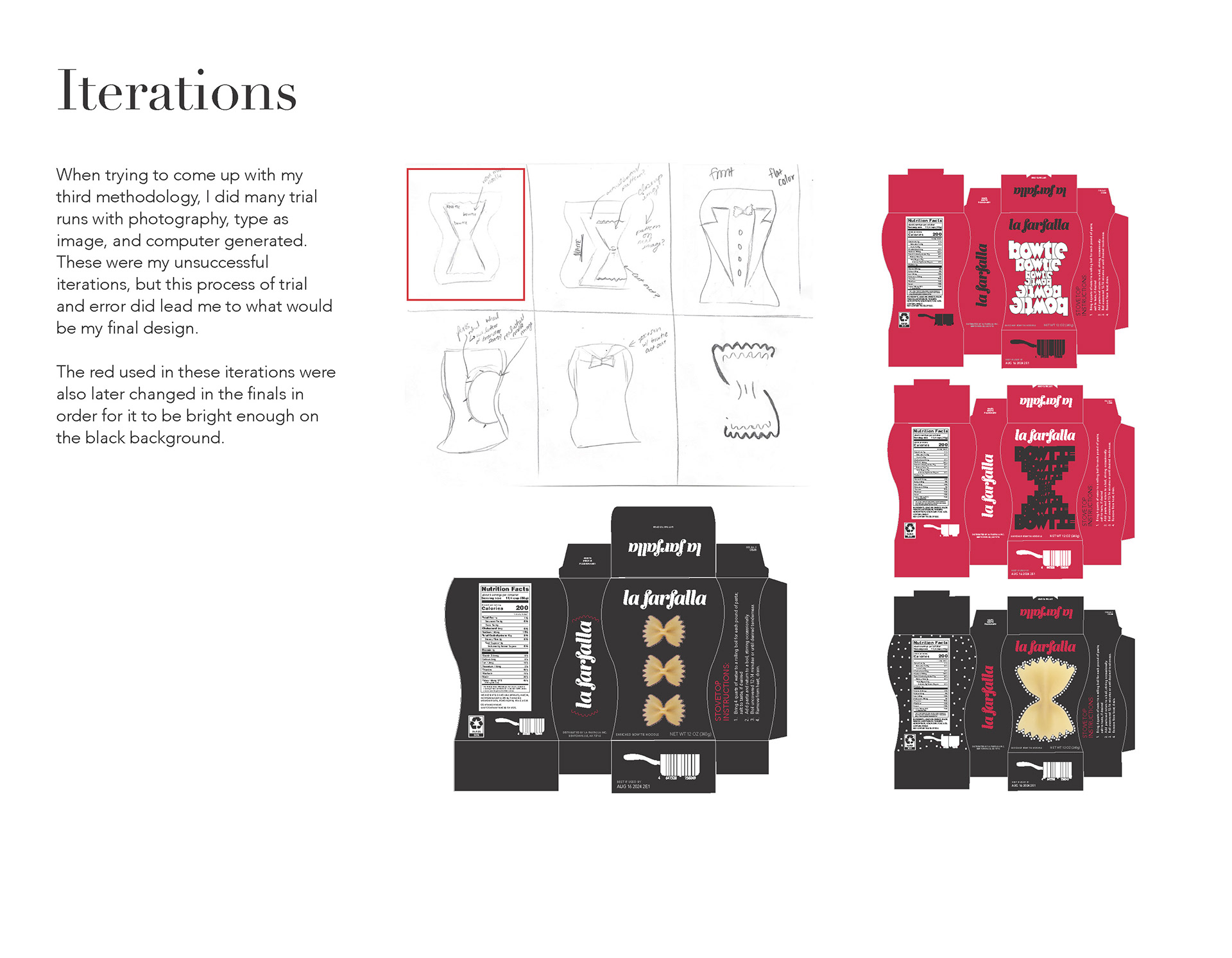
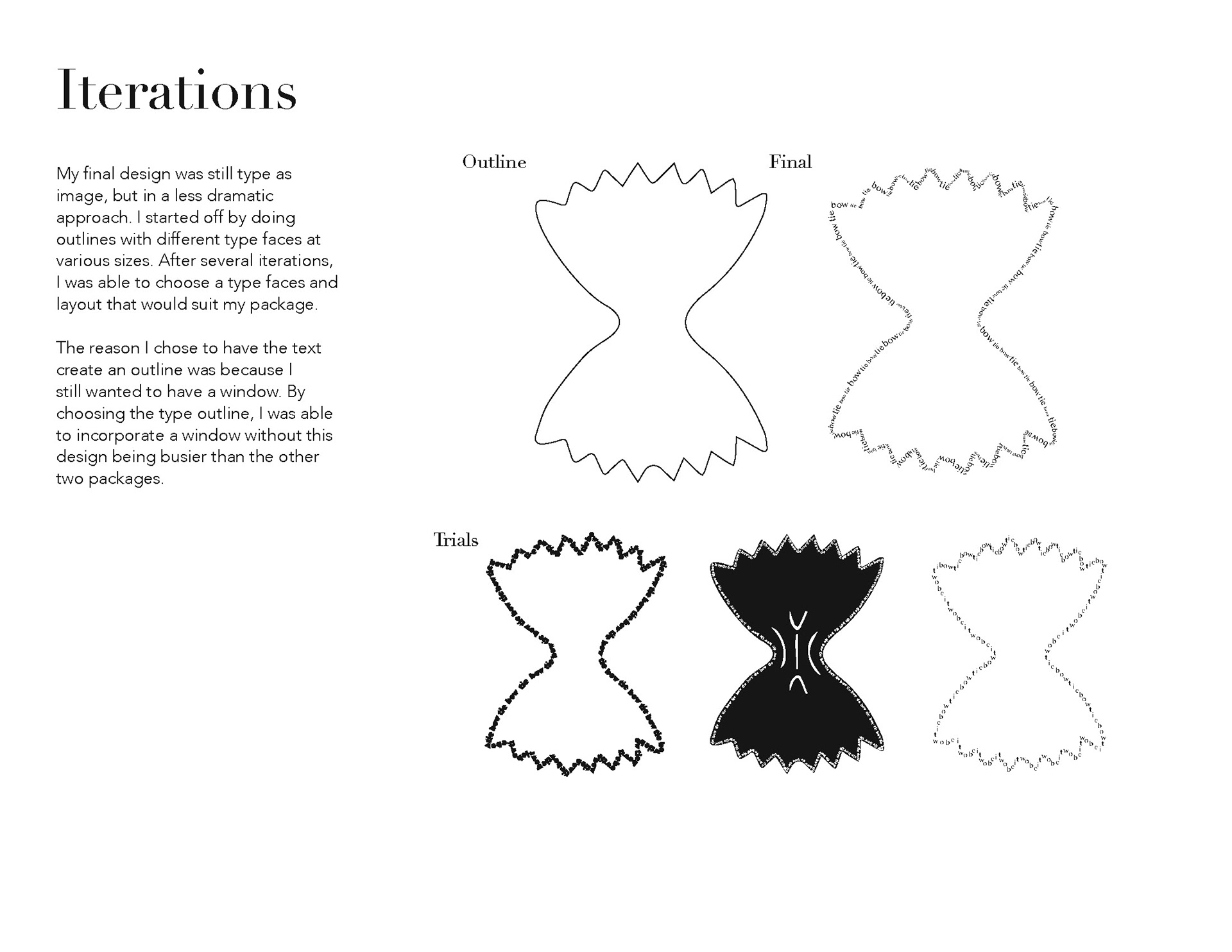
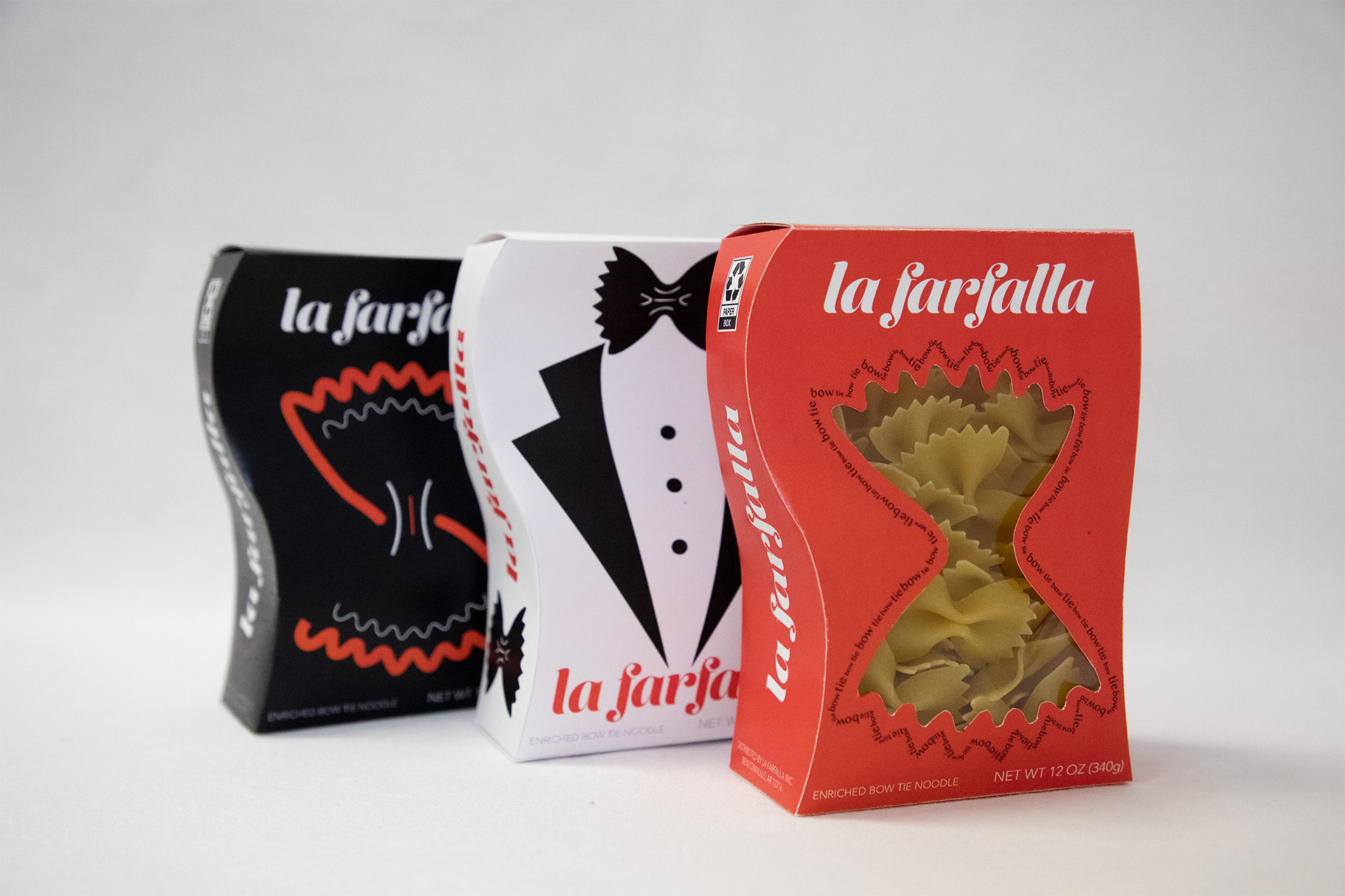
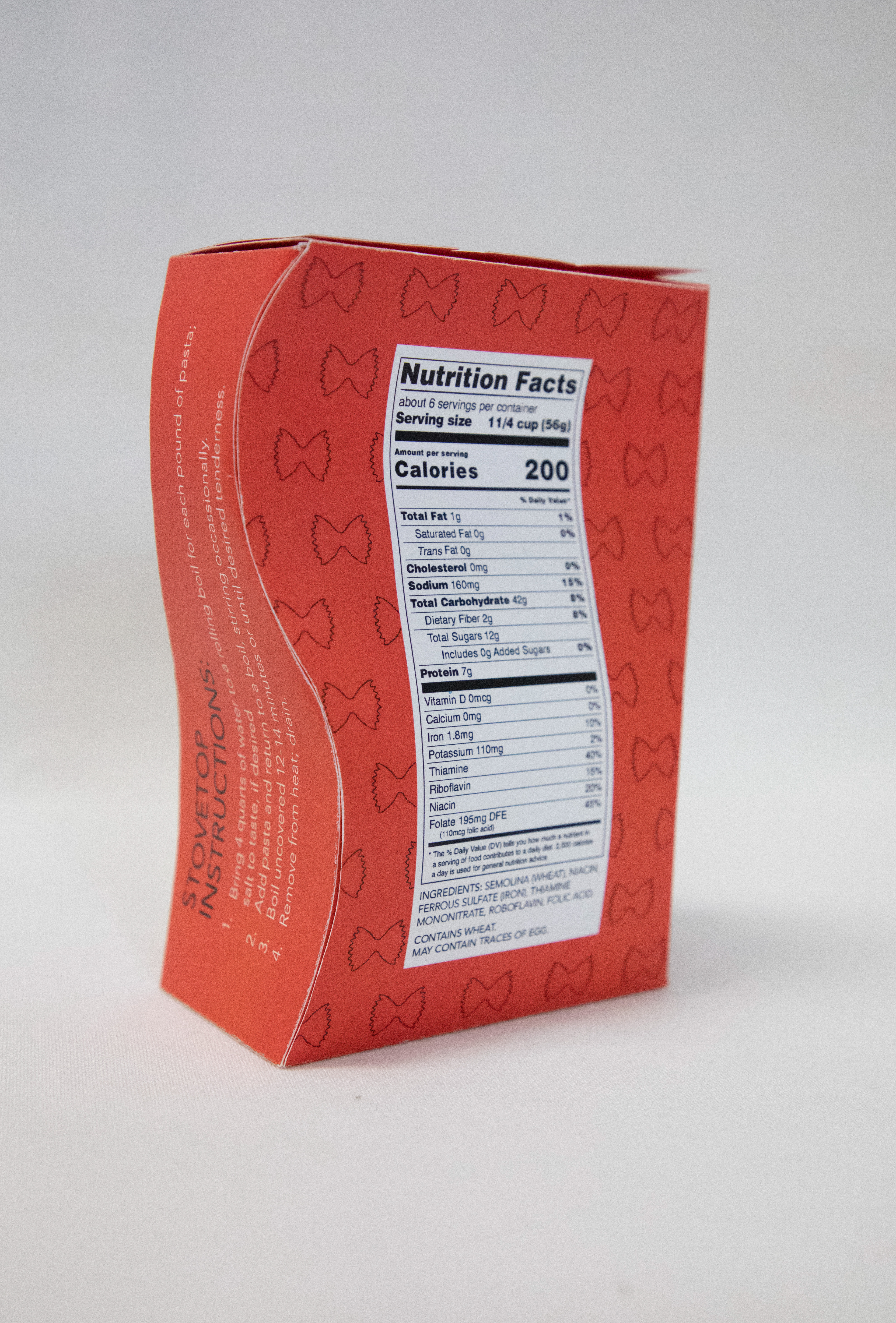
Here is the pasta packaging centered on using three visual methodologies: illustration, flat color, and type only to brand products. The die cut pattern was chosen for its unique shape that mimics the bow tie pasta.
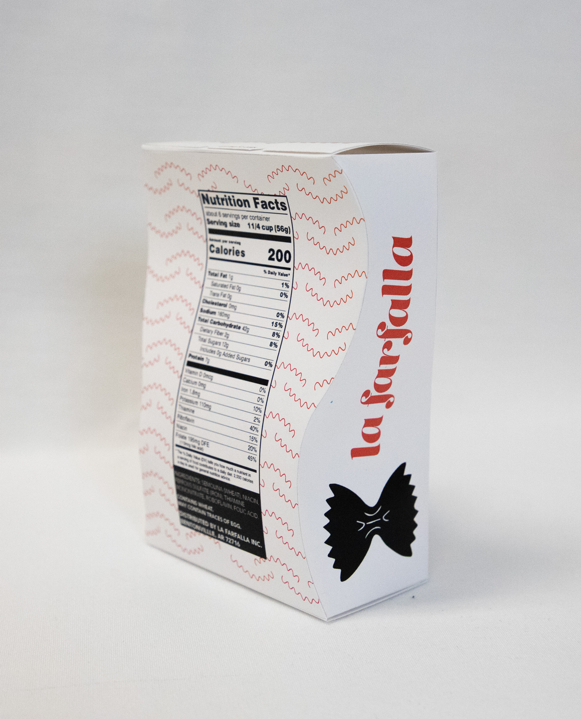

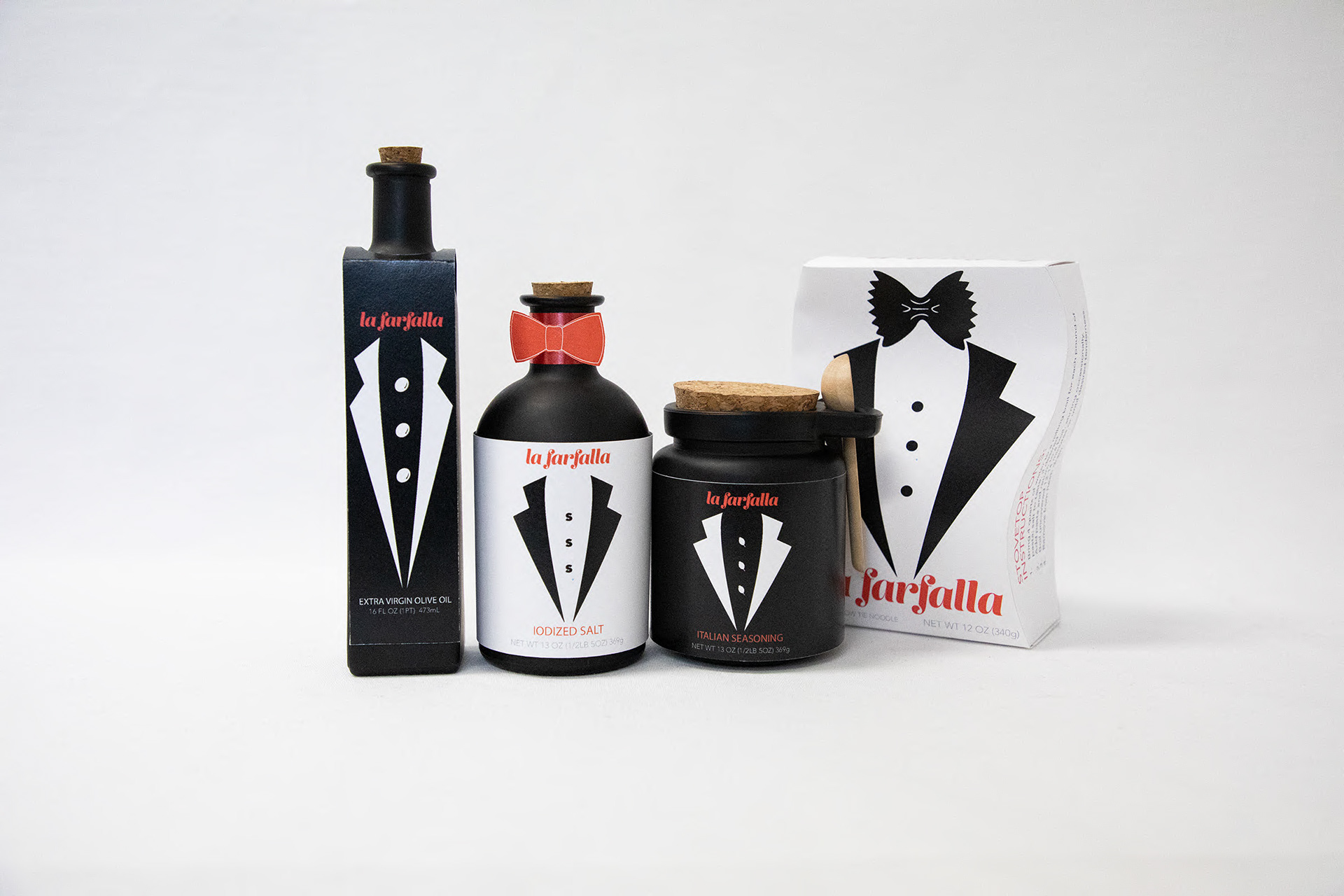
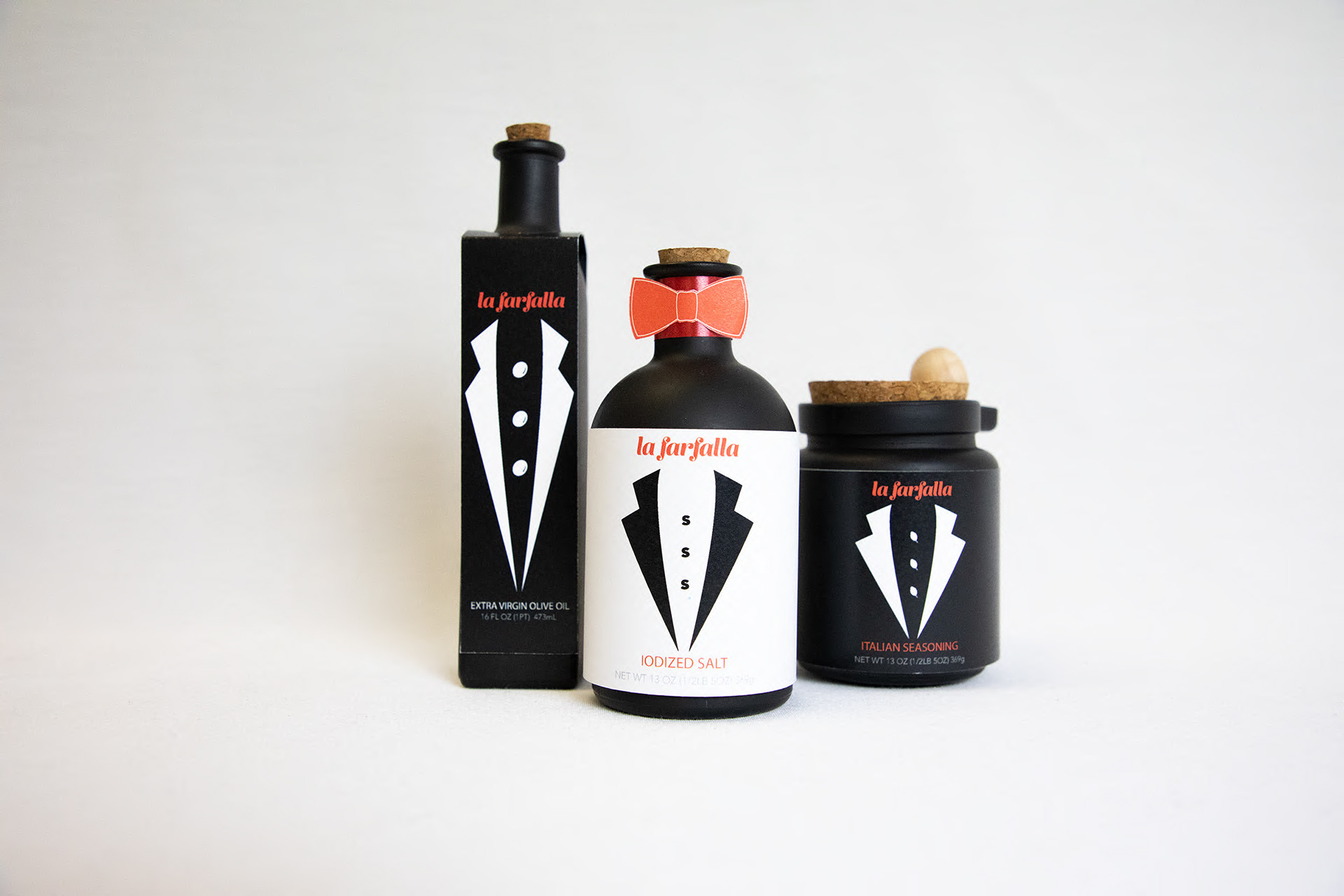
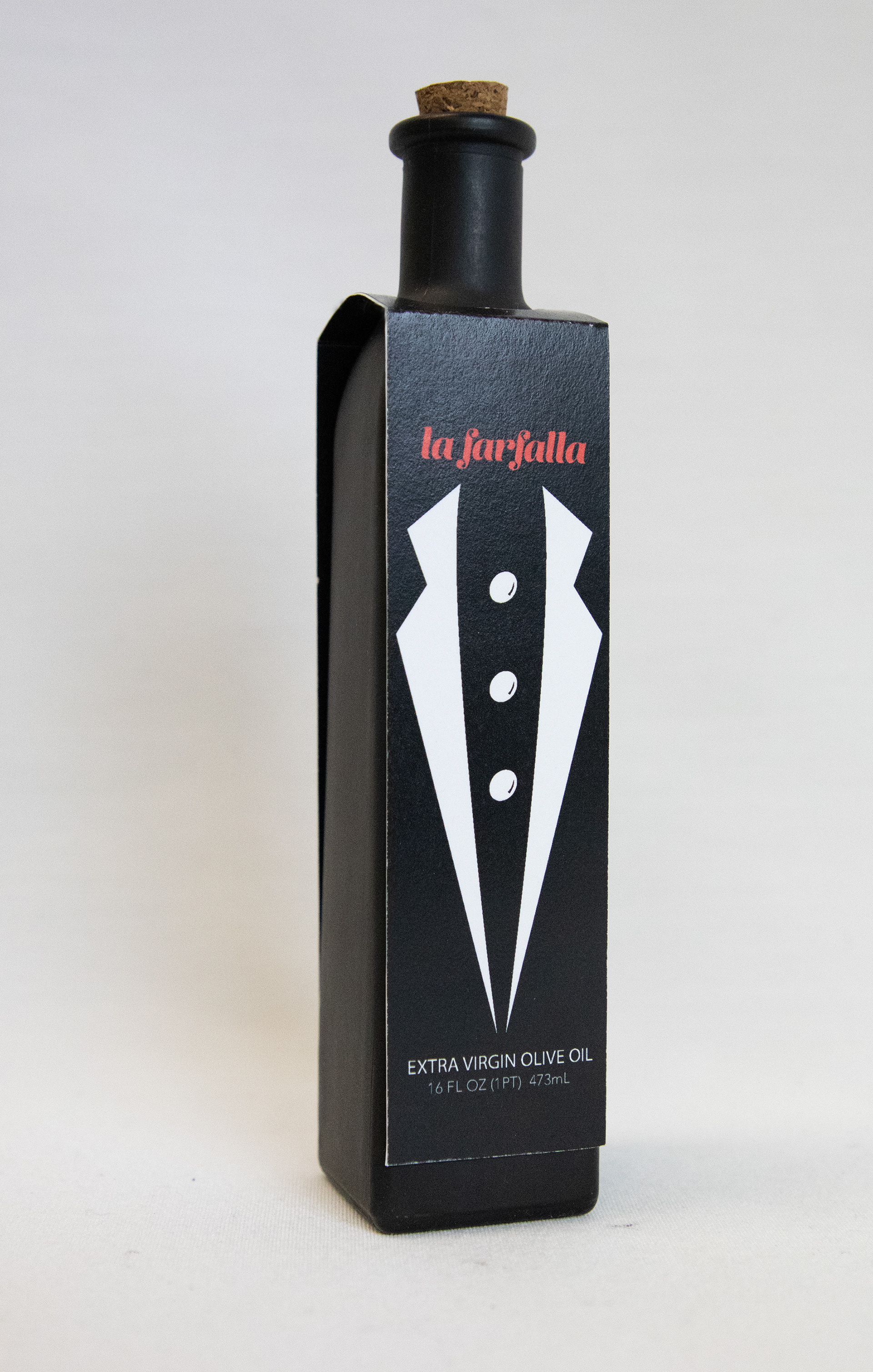
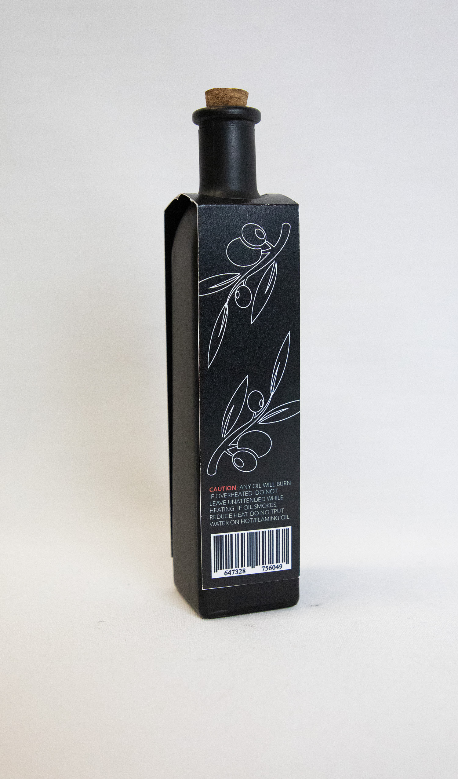
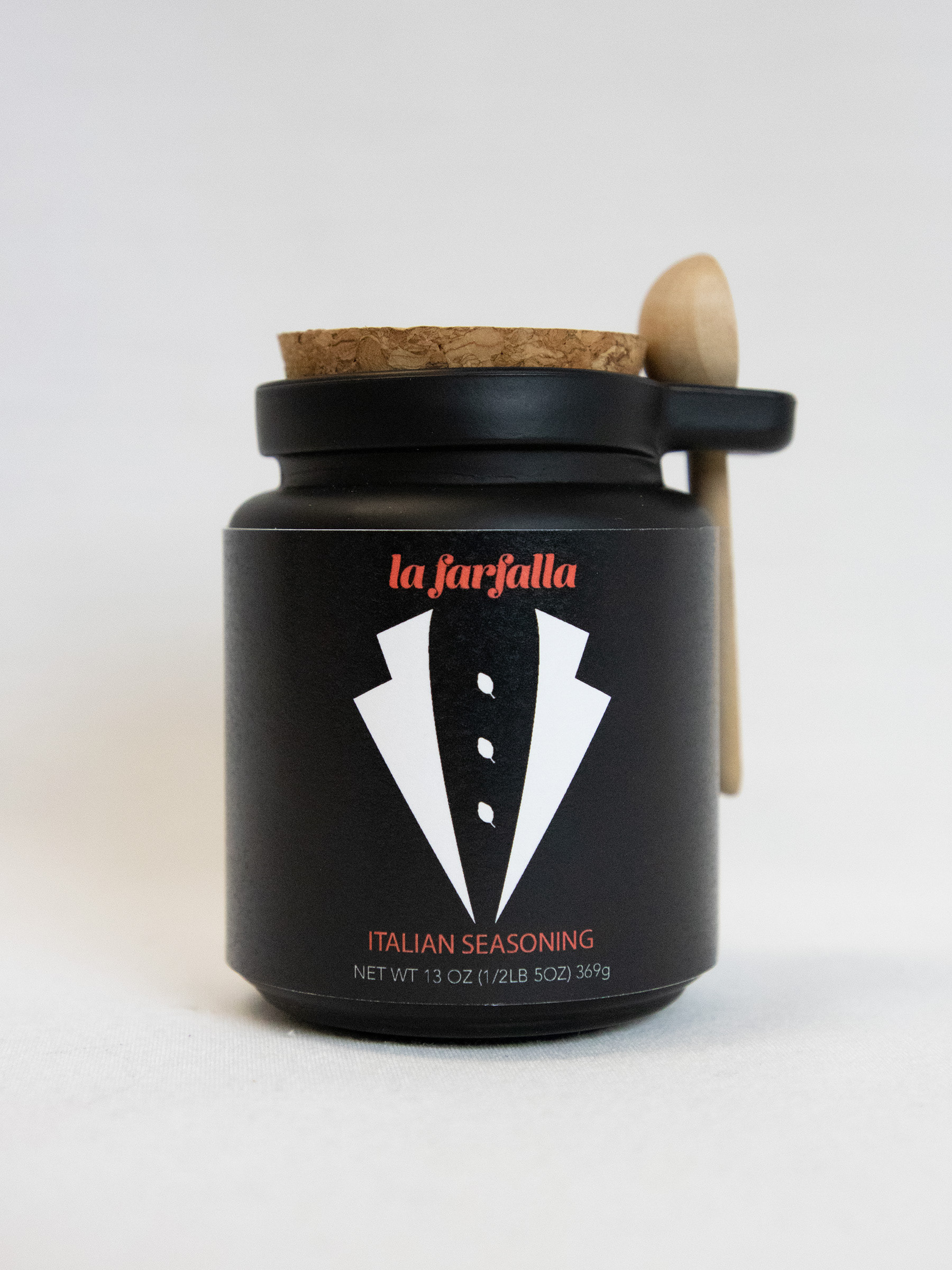
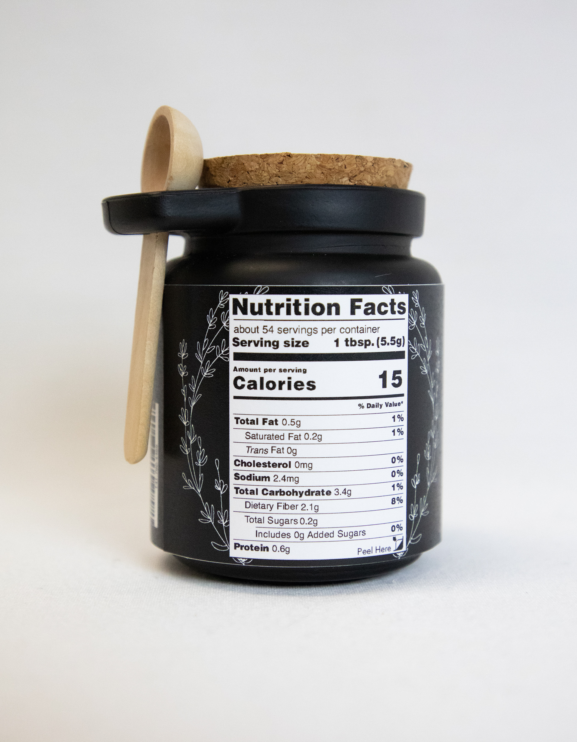
Below are the final branding solutions for the new La Farfalla pasta, spice, and oil line of fine Italian ingredients. Sustainability is important to the La Farfalla family, so the materials used for packaging are reusable or recyclable.
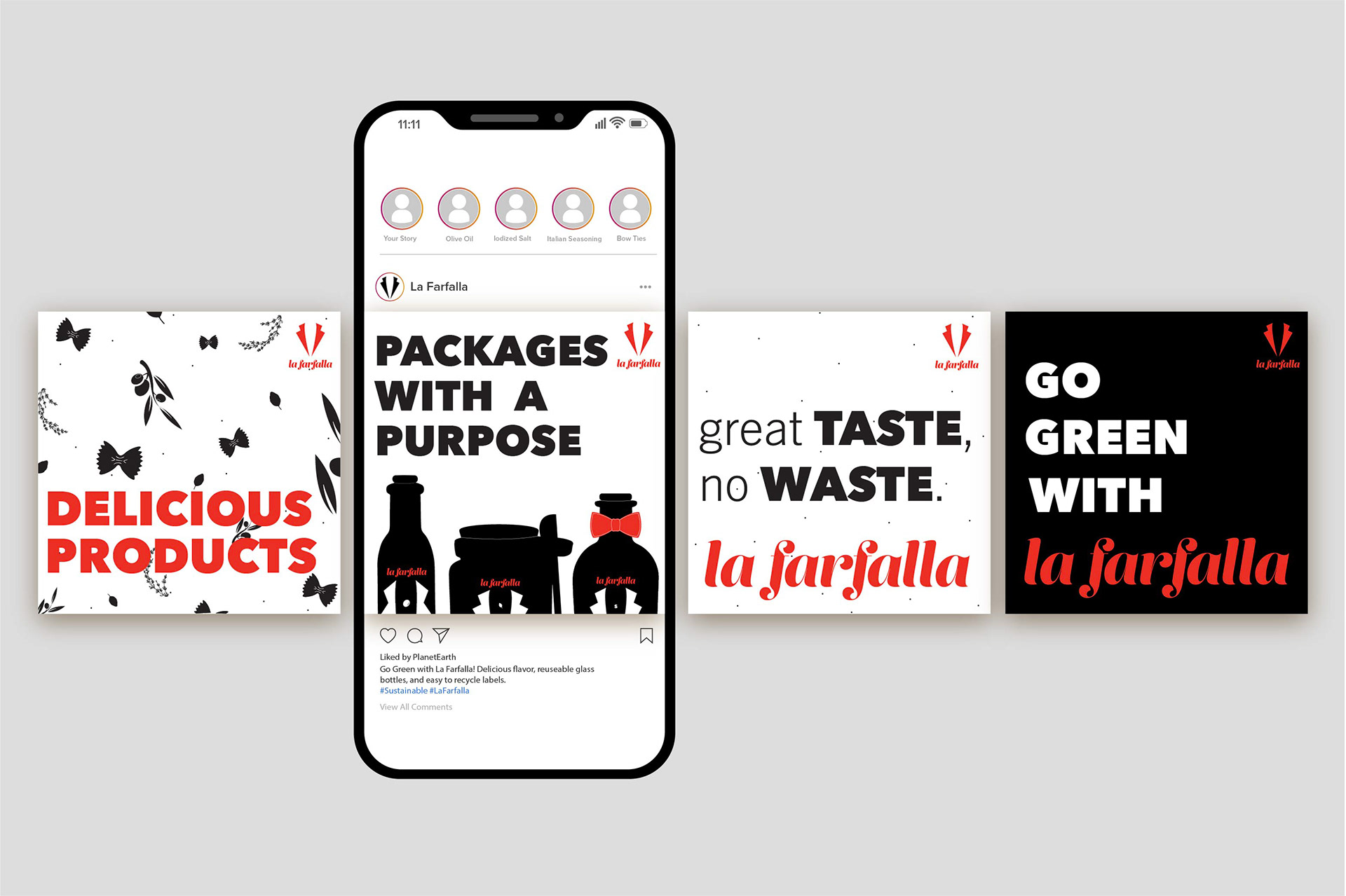
Sustainability Instagram Ads

Magazine Ad
PROCESS